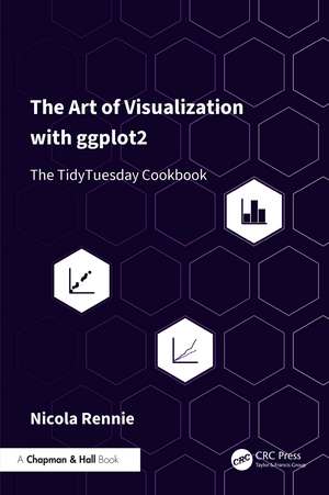
The Art of Data Visualization with ggplot2: The TidyTuesday Cookbook
Autor Nicola Rennieen Limba Engleză Paperback – 25 ian 2027
The visualizations in this book are not necessarily always the most effective choice of visualization for the data and relationship shown. Rather, this book aims to show you examples of the end-to-end process of creating data visualizations, with a focus on the technical details of building them in R.
This book is primarily aimed at those who wish to develop their data visualization skills in R. Readers of this book may find a basic knowledge of R, more specifically of the tidyverse ecosystem, useful - although all code used in examples is fully explained. Readers do not need to be experienced in ggplot2, though this book will also be of interest to those who are. This book will also be of interest to those who are already familiar with R (including ggplot2), and wish to develop their skills in designing data visualizations further. It will also interest those who already design data visualizations using other tools, and want to learn how to do the equivalent in R.
Preț: 418.05 lei
Preț vechi: 526.18 lei
-21% Precomandă
Puncte Express: 627
Carte nepublicată încă
Livrare prin curier în România Precomanda se expediază când titlul devine disponibil.
Transport gratuit pentru acest produs Plată online sau ramburs, în funcție de opțiunile comenzii.
Retur gratuit în 14 zile Comandă securizată și suport în română.
Doresc să fiu notificat când acest titlu va fi disponibil:
Se trimite...
Specificații
ISBN-13: 9781032766232
ISBN-10: 1032766239
Pagini: 392
Ilustrații: 264
Dimensiuni: 156 x 234 mm
Ediția:1
Editura: CRC Press
Colecția Chapman and Hall/CRC
ISBN-10: 1032766239
Pagini: 392
Ilustrații: 264
Dimensiuni: 156 x 234 mm
Ediția:1
Editura: CRC Press
Colecția Chapman and Hall/CRC
Public țintă
Adult education, Postgraduate, Professional Practice & Development, and Undergraduate AdvancedNotă biografică
Nicola Rennie is a data visualization specialist and enthusiast, with an academic background in mathematics and statistics. She holds a PhD in Statistics and Operational Research, which focused on analysing and visualising transport demand. She is particularly interested in how we use data visualization to communicate complex, quantitative information in an accessible way, as well as the intersection of visualization and art. She has experience of teaching at both undergraduate and postgraduate level, in courses covering fundamentals of data science, statistical methods, and programming. Nicola has also previously worked in data science consultancy, and delivered training courses covering topics including advanced data visualization with R, statistical modelling, and reproducible reporting. She is the author and maintainer of several R packages, including multiple ggplot2 extension packages. Nicola is a regular speaker at R and data science meetups, has been the chapter organizer of R-Ladies Lancaster, and part of the R-Ladies Global Team. She is co-author of the Royal Statistical Society’s Best Practices for Data Visualisation Guide, and is an active member of the Royal Statistical Society. Several of her data visualizations have been long-listed at the Information is Beautiful Awards.
Cuprins
1. Introduction Part 1: Common charts don’t need to be boring! 2. Programming languages: dumbbell charts with ggplot2 3. UK museums: highlighting line charts with gghighlight 4. Bee colony losses: visualizing quantities with Poisson disk sampling 5. Animal shelter intakes: making gauge charts with ggforce Part 2: Making use of icons fonts and text 6. Canadian wind turbines: waffle plots and pictograms 7. Cats: data-driven annotations with ggtext 8. Nobel Prize laureates: positioning text and parameterizing plots Part 3: Working with images 9. Lemurs: manipulating images in R 10. R packages: using images for custom facet labels Part 4: Visualizing spatial data 11. Doctors across the world: making maps with ggplot2 12. Time zones: spatial data and mapping with sf 13. US House elections: geography on a grid with geofacet 14. Other tips and tricks
Descriere
The visualizations in this book are not necessarily always the most effective choice of visualization for the data and relationship shown. Rather, this book aims to show you examples of the end-to-end process of creating data visualizations, with a focus on the technical details of building them in R.