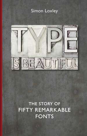
Type Is Beautiful
Autor Simon Loxleyen Limba Engleză Hardback – 15 oct 2016
Descoperim în paginile volumului Type Is Beautiful o perspectivă inedită asupra lumii vizuale care ne înconjoară, transformând caracterele tipografice din simple instrumente de redare a textului în protagoniste ale unei istorii culturale fascinante. Suntem de părere că Simon Loxley reușește să scoată la lumină povești care anterior erau accesibile doar specialiștilor, oferind cititorului o experiență senzorială bogată prin analiza a 50 de fonturi care au definit epoci. Reținem nu doar evoluția estetică, ci și dramele umane din spatele metalului turnat, cum este cazul lui Thomas Cobden-Sanderson, care a ales să își arunce creația în apele Tamisei pentru a-i asigura exclusivitatea eternă.
Ca și The Evolution of Type de Tony Seddon, acest volum pune în valoare reperele fundamentale ale designului, de la Biblia lui Gutenberg la Helvetica, dar cu un accent pe narațiunea biografică și contextul social care a dus la succesul sau eșecul unei familii de caractere. Structura este una progresivă și riguroasă: textul ne poartă prin 50 de capitole dedicate, de la eleganța clasică a lui Garamond și Bodoni, până la utilitarismul Johnston Sans creat pentru metroul londonez sau omniprezentul, deși blamatul, Comic Sans.
Această lucrare reprezintă o evoluție naturală față de volumul anterior al autorului, intitulat simplu Type, aprofundând aici legătura dintre personalitatea designului și impactul său asupra culturii de masă. Editura Bodleian Library propune un format hardback elegant, unde calitatea reproducerilor vizuale susține demonstrația teoretică, făcând din fiecare pagină o lecție de estetică aplicată. Este o incursiune în care litera devine imagine, iar istoria se citește printre rânduri, la propriu.
Preț: 153.93 lei
Carte disponibilă
Livrare economică 27 octombrie-10 noiembrie
Livrare express 10-16 octombrie pentru 34.83 lei
Specificații
ISBN-10: 185124431X
Pagini: 288
Ilustrații: 50 halftones
Dimensiuni: 143 x 218 x 29 mm
Greutate: 0.54 kg
Editura: Bodleian Library
V-ar putea interesa
-
 An Essay on TypographyEric Gill-28%Preț: 49.95 lei69.55 lei
 -
 The Universal PenmanGeorge Bickham-17%Preț: 120.08 lei143.99 lei
 -
 Gothic and Old English AlphabetsDan X. Solo-19%Preț: 83.63 lei103.27 lei
 -
 Script and Cursive AlphabetsDan X. SoloPreț: 96.05 lei
 -
 TypologiaFrederic W GoudyPreț: 263.45 lei
 -
 Universal Principles of TypographyElliot Jay Stocks-17%Preț: 192.52 lei232.88 lei
 -
 BaskervilleSimon GarfieldPreț: 121.97 lei
 -
 Albertus: The Biography of a Typeface (The ABC of Fonts)Simon Garfield-28%Preț: 76.10 lei105.23 lei
 -
 Baskerville: The Biography of a Typeface (The ABC of Fonts)Simon Garfield-28%Preț: 76.10 lei105.23 lei
 -
 Comic Sans: The Biography of a Typeface (The ABC of Fonts)Simon Garfield-28%Preț: 75.94 lei105.13 lei
 -
 -26%Preț: 58.60 lei78.99 lei
 -
 The Fundamentals of TypographyGavin Ambrose-13%Preț: 211.87 lei243.17 lei
 -
 Back to Font: Behind the Typefaces You Thought You KnewAnitra Nottingham-32%Preț: 104.31 lei152.44 lei
 -
 The Visual History of TypePaul McNeil-22%Preț: 446.36 lei570.31 lei
 -
 Thinking with TypeEllen Lupton-10%Preț: 144.36 lei160.88 lei
 -
 Just My Type: The original and best book about fontsSimon Garfield-19%Preț: 76.53 lei94.01 lei
 -
 Type Designers of the 20th CenturyDavid JuryPreț: 368.88 lei
 -
 The ABC of TypographyDavid Rault-10%Preț: 99.81 lei110.69 lei
 -
 Type: A Visual History of Typefaces & Graphic StylesCees W. de Jong-8%Preț: 549.86 lei597.68 lei
De ce să citești această carte
Recomandăm această carte oricărui pasionat de design grafic sau istorie culturală care dorește să înțeleagă de ce anumite fonturi ne influențează percepția fără să ne dăm seama. Veți câștiga o privire educată asupra mediului urban și digital, învățând să recunoașteți amprenta unor maeștri precum Baskerville sau Gill Sans. Este un ghid esențial pentru a trece de la simpla utilizare a unui procesor de text la aprecierea unei forme de artă vechi de jumătate de mileniu.
Despre autor
Simon Loxley este un designer grafic independent și scriitor specializat în design, cunoscut în comunitatea profesională ca editor fondator al revistei Ultrabold. Experiența sa practică în domeniu se împletește cu o pasiune pentru cercetarea istorică, permițându-i să traducă terminologia tehnică a tipografiei într-un limbaj accesibil și captivant. Prin lucrările sale, Loxley explorează puntea dintre scriitor și cititor, evidențiind modul în care tipografia funcționează ca un purtător de mesaj invizibil, dar esențial pentru înțelegerea gândirii umane.
Descriere scurtă
Type is Beautiful traces the history of fifty remarkable fonts. Thoroughly researched and visually exciting, it takes readers through the story of each font’s creation and distinct characteristics, as well as why it succeeded or failed. Some of the fonts were commissioned for major commercial or cultural projects. Edward Johnston’s iconic Johnston Sans, for instance, was created for the London Underground and remained there exclusively until a redesign in the 1980s. Other fonts became culturally significant unintentionally. The designer of the controversial Comic Sans created the typeface to fill the need for a font to fit the speech bubbles for a Microsoft program, never expecting it to become one of the world’s favorite—and most-maligned—fonts. Along the way, Loxley gives readers an unforgettable cast of characters, including Johannes Gutenberg, William Caslon, Nicolas Jenson, Stanley Morison, William Morris, and Thomas Cobden-Sanderson, the English artist and bookbinder who famously “bequeathed” the unique metal type created for his failed Doves Press to the Thames, casting the type into the river to prevent its future use.
Brimming with fascinating facts, Type is Beautiful is a highly informative and entertaining trip through a lesser-known aspect of history that turns out to have major significance for print and design culture. From Blackletter to Baskerville and Bodoni, you will find yourself looking at fonts with a newfound appreciation.
Notă biografică
Cuprins
Introduction
Gutenberg’s Bible Type
Jenson’s Roman Type
The Aldine Italics
Fraktur
Garamond
Caslon
Caslon’s English Arabick
Baskerville
Bodoni
Fat Face Italic
Two Lines English Egyptian
Pouchée’s 18 Lines No. 2
Braille
Chinese Advertiser Characters
French Antique
Typewriter Faces
Golden Type
Doves Type
Arnold Böcklin
Cloister Black
Centaur
Goudy Old Style
London Underground
Souvenir
Cooper Black
Neuland
Arrighi
Future
Broadway
Gill Sans
Times New Roman
Peignot
Stencil
Super Veloz
Helvetica
Calypso
Transport
Antique Olive
Data 70
Bloody Hell
Arcadia
Mason
Natwest
Comic Sans
Amanar
Channel 4 Fonts
Guardian Egyptian
Piel Script
Lushootseed
Zulia
Bibliography
Picture Credits
Index
Descriere
Behind every typeface is a story - who designed it, and why? What are its distinctive characteristics, and what cultural baggage does it carry? This book explores fifty of the most remarkable typefaces, dating from the birth of European printing in the fifteenth century (and the type used in the Gutenberg Bible - the first significant book to be printed in Europe) to the present day. It features key examples in the aesthetic development of typography (Caslon, Baskerville, Bodoni) and those fonts which have made a significant impact on the wider world. Many fonts have added style to something culturally important (such as Johnston Sans on the London Underground), or assumed a cultural significance of their own, sometimes by accident. The designer of Comic Sans, for example, created the typeface for use in speech bubbles for a Microsoft programme, never expecting it to become one of the world's favourite - and also most maligned - fonts. Through the fonts this book also examines the often colourful lives of the key designers in the evolution of typography: Johannes Gutenberg, William Caslon, Nicolas Jenson, Stanley Morison and William Morris, among others - including one who threw his unique set of metal type into the Thames to prevent others from misusing it - and the enduring influence they have had on print culture. Of equal appeal to general readers, designers and typographers, this book is a vibrant cultural guide to the aesthetic choices we make in order to spread the word.